Context
FlowCo is a leader in production optimization, artificial lift, methane abatement, and vapor recovery in the oil and gas industry. Their focus is partnering with exploration and production operators to maximize performance and well longevity from first production through its lifecycle.
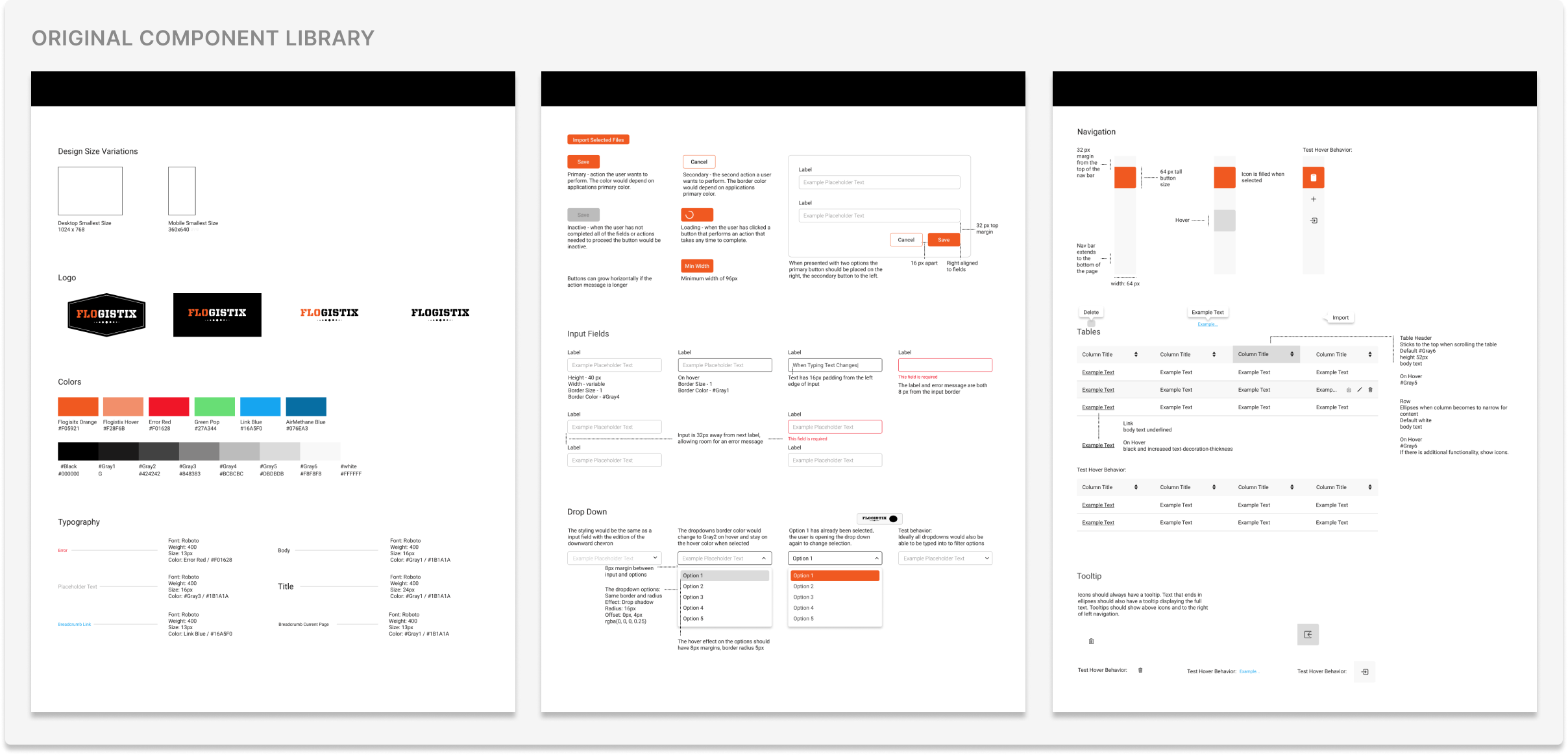
I joined FlowCo as a Product Designer and Manager during a transition period of their component library and one of my first tasks was to assist in the redesign effort. The beginning components were deployed into our products a few weeks into my role, and what followed was a consistent effort to audit the library into something that actually served our users and products. Over the following year, I worked alongside another designer, a product manager, and our frontend development team to redesign and build FlowCo's official design system, Flo UI. During that time, I moved from individual contributor to the sole owner, which led to redefining components, the Storybook build, and creating the principles it runs on today.
Problem
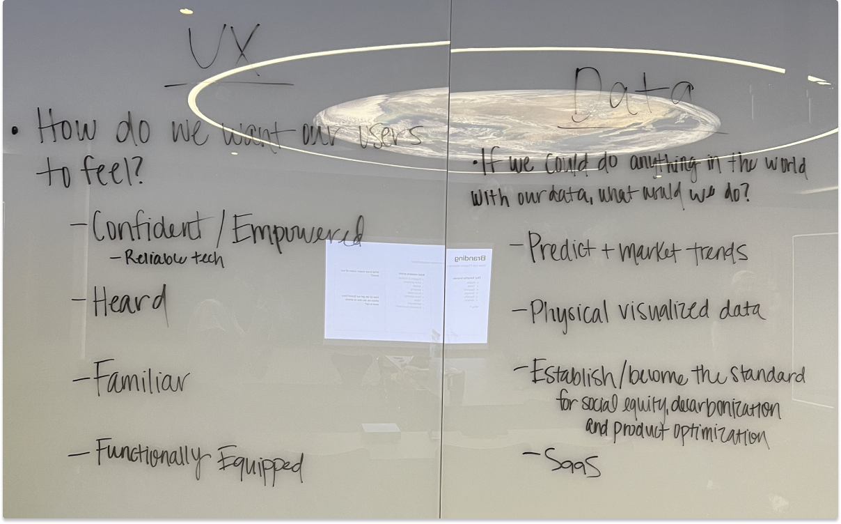
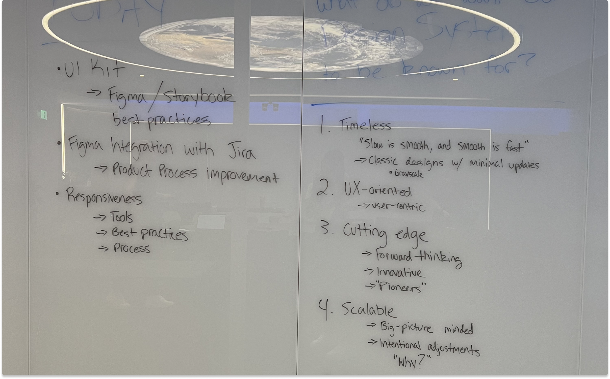
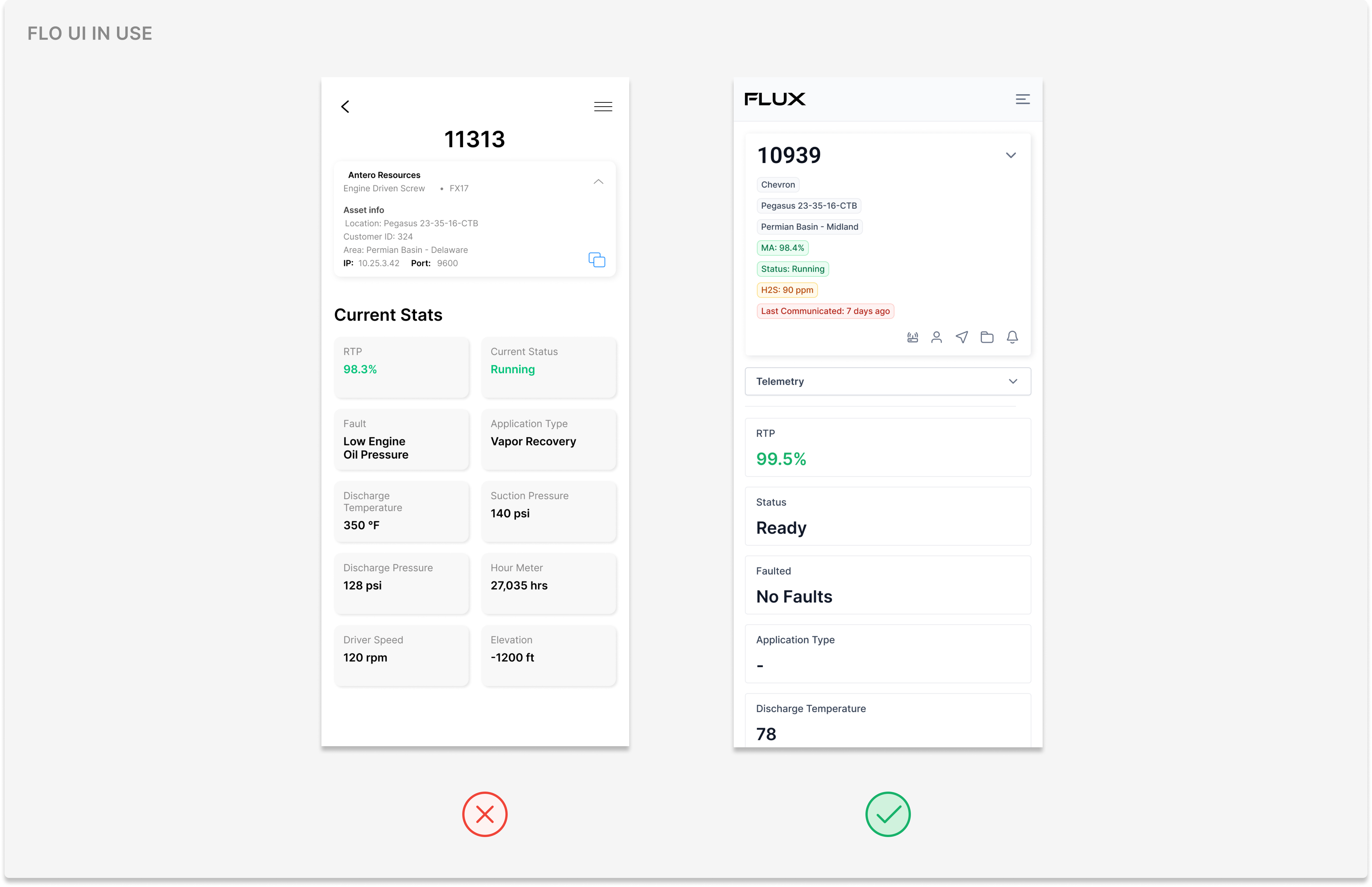
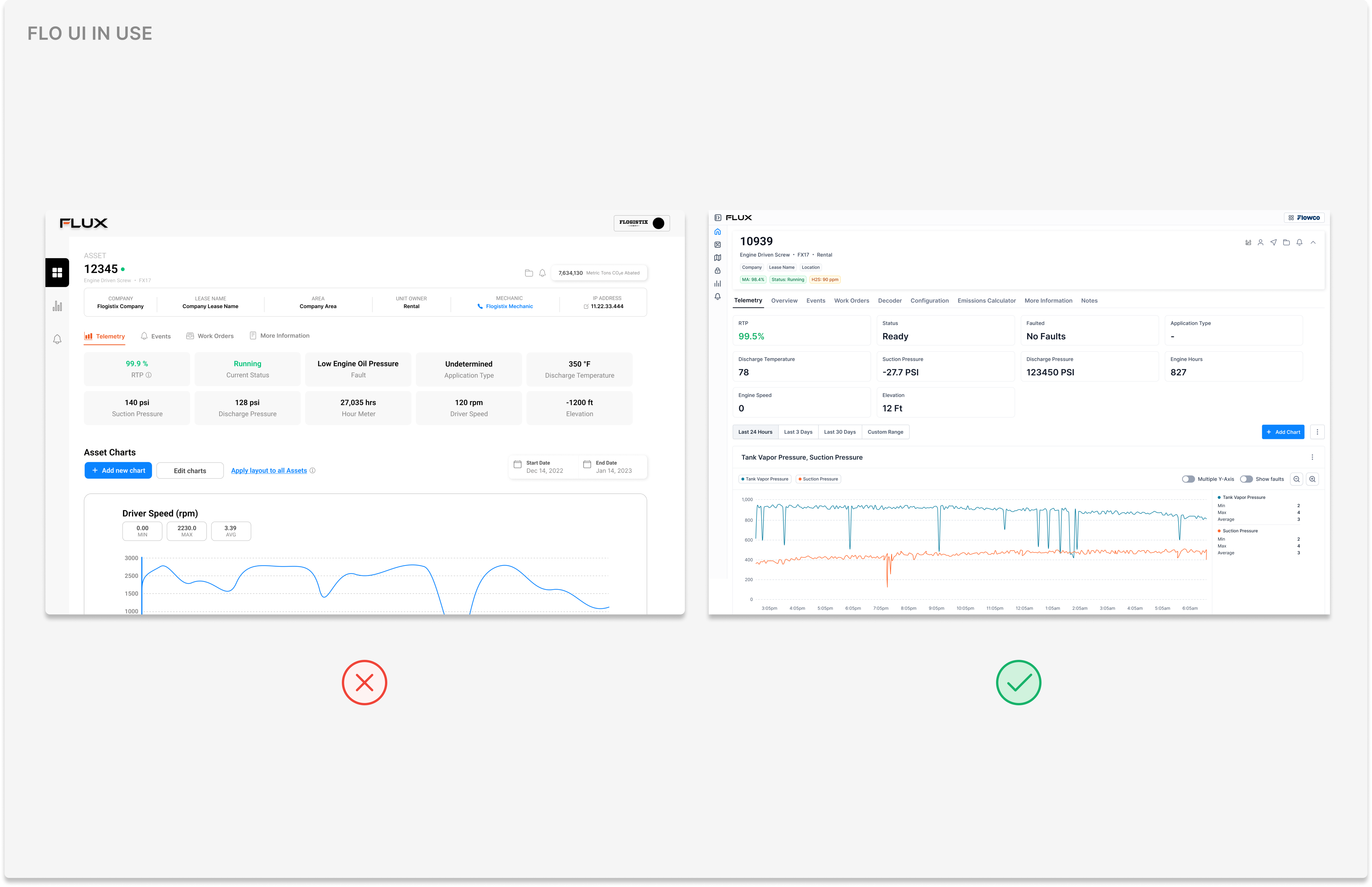
When I started, the existing design library was modern and visually appealing, but not accomodating for our users. Styles like rounded corners, lighter colors, and large padding didn't hold up against how our products are used in the real world. Our applications are mostly used in physical environments with varying lighting conditions, and the lighter colors made important information difficult to read in the field. Additionally, the padding standards forced users to excessively scroll to access key information. It became clear that we needed to pivot, and translate the received feedback into new design standards. We began by defining our product vision, building a roadmap, and defining our principles.
Research
We looked at how mature product systems approached design systems, ultimately focusing on three: Apple, Tesla, and Google. We liked Apple for familiarity and how users already understand interaction patterns intuitively; Tesla for a modern interface; and Google for a system that's flexible enough to combine multiple products under one visual language.
Goals
Pulling from our research, our goals were to redesign the system into something accessible, industrial, and intuitive for our users. After doing a competitive analysis, we uncovered that most of the products used in our industry had industrial-like interfaces, rather than modern ones. We wanted to stick with styles and patterns that our users are used to. However, our biggest constraint was team bandwidth, as we didn't have capacity to build new components, revisit old components, and build the Storybook within a reasonable timeframe. Given our capacity, I suggested using a pre-built design system. I evaluated different kits against our specific needs and selected Untitled UI, an actively maintained kit that gave us a foundation to build on. I received buy-in from the team, then we began designing from there.
Process
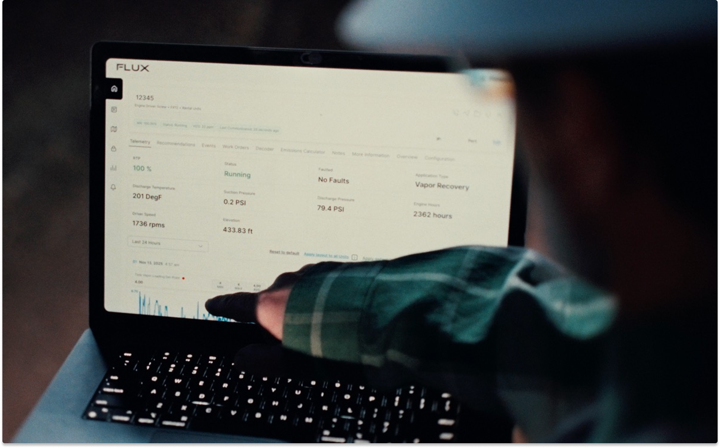
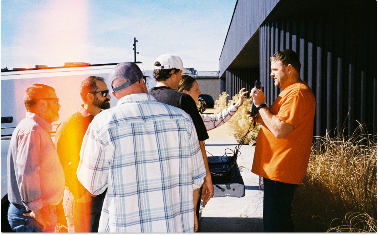
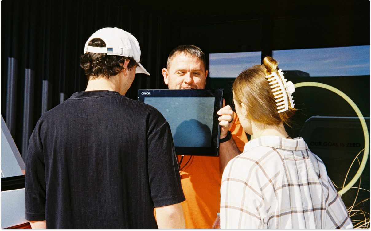
Using Untitled UI, we collaborated on selecting styles and components that fit our needs. To validate our choices, we tested in parking lots, company vehicles, and oil sites. Along the way, we gathered additional context about the tools our users rely on, such as the PLC panel (Programmable Logic Controller), a digital computer used for equipment automation. We also took into consideration how mechanics wear Personal Protective Equipment gloves on-site, meaning it can be difficult for them to navigate on mobile. This context informed our accessibility approach and design system principles, built on Untitled UI's standards and validated through in-person collaboration with stakeholders and users.
Around this point in the project, my colleague transitioned to the creative department and ownership of the design system became fully mine. We needed a design system that met user needs with ease, allowed us to iterate on, and was designed for the user's worst day. The product manager and I defined principles as I finished auditing and establishing components, landing on three:
Reduce friction for the person doing the work — every decision should make the task in front of the user easier.
Scale without chaos — the system should grow to support new products and features without fragmenting into one-off solutions.
Physical-first thinking — design for the environment the product is actually used in: gloves, glare, vibration, and split-second decisions in the field.
Collaboration with Engineering
I worked with engineering through four interconnected problems: what components to keep, how to structure them, what to call them, and how to think about them as a whole.
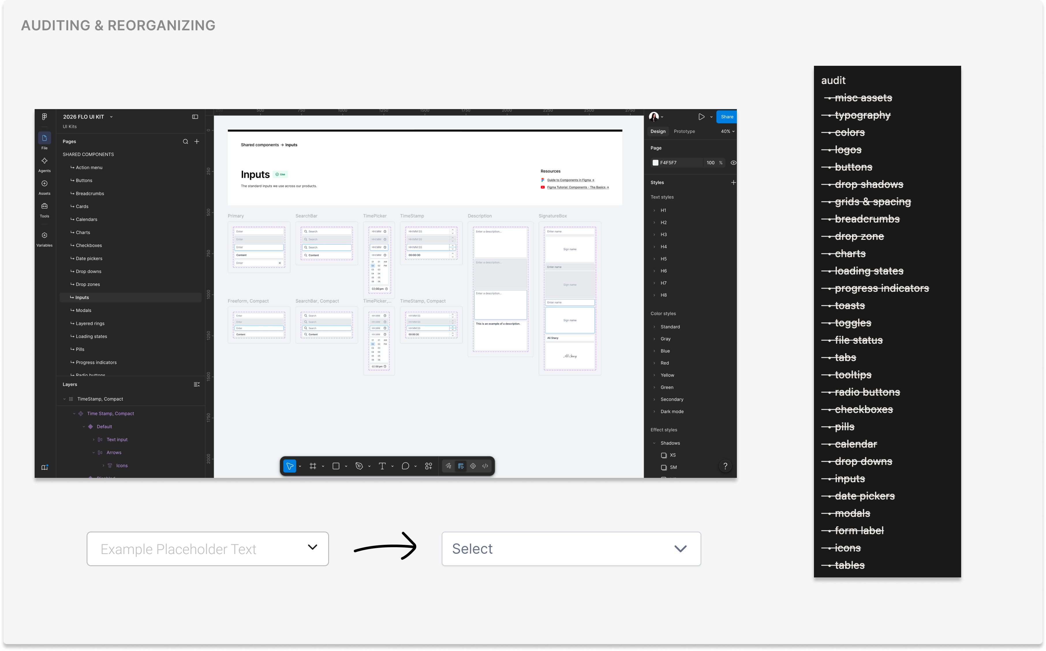
I started by documenting every component across our products, then cross-referenced it against real usage. For each component, I evaluated whether it was solving a user need, duplicated across features, and whether it held up against our new principles. Components that failed on legibility got flagged first, since those directly affected whether a technician could use the component in the field. I collaborated with engineering to decide which components were safe to retire versus which had enough dependencies that they needed a phased deprecation. This audit became the backlog, prioritized by usage and risk.
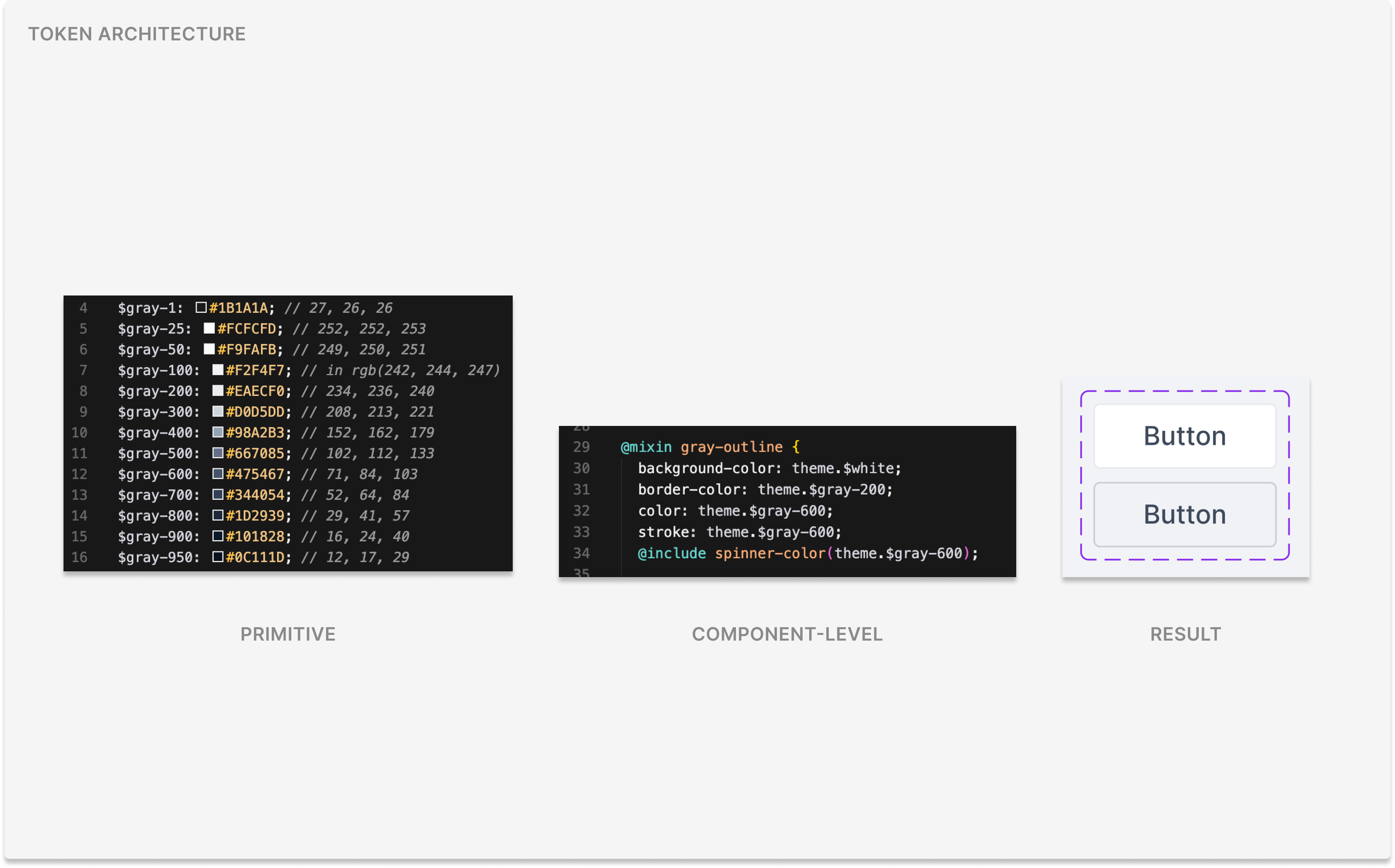
Next, we worked to define tokens so that styling traced back to a source of truth for color, spacing, and typography. We organized tokens in two ways: primitive tokens, which we established early on to cover our raw values for color, spacing, and typography, and component-level tokens, which we're currently building out to map those primitives to individual components. Variants were also scoped in, as we decided which variants represented a recurring use case or a one-off request that should live in a feature instead. This discipline kept the component sets small enough for engineering to maintain.
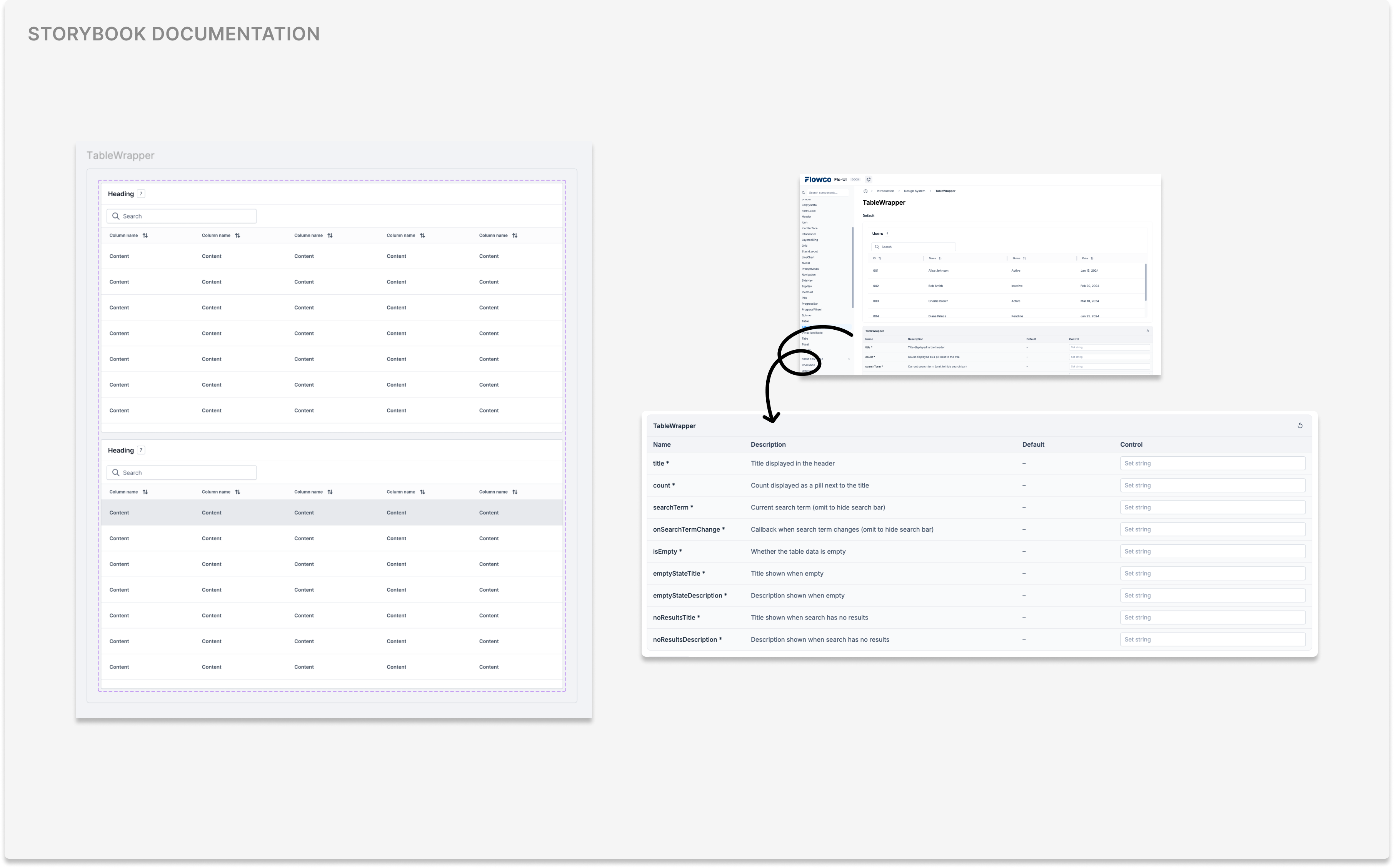
Lastly, naming was inconsistent between design and code, which slowed handoff and created conflict between what Figma showed and what shipped. I worked with the frontend team to establish a shared naming convention across both, so a component's name, its props, and its token references matched one-to-one between design files and Storybook. The Storybook was built with the engineer as the primary reader so that they could self-serve most implementation questions.
We treated Flo UI as a system rather than a component library, meaning every decision was made by how it would expand across the whole product suite. Before finalizing a component, I asked how it would behave across different products, screen sizes, and edge cases like poor connectivity or lighting. This meant working closely with engineering to understand technical constraints early, rather than discovering conflicts later. It also meant being willing to say no to one-off requests that would fragment the system, even when they solved an immediate need, in favor of solutions that scaled across FlowCo's products.
Results and Impact
Before this initiative, the team relied on custom components for each feature. Now, we share a Storybook library where components are reusable and has cut down development time, accelerating our design output and made it more consistent. In 2026, I've integrated Flo UI into the Figma MCP server, Claude Code, and Cursor, streamlining handoff for developers and making prototyping more accessible for PMs. We continue to build on our design system every day, and the impact continues to be noticable across our products.
Reflection
I'm proud of these efforts. Throughout the project, I encountered several challenges such as balancing user needs with a modern vision in oil and gas and considering physical workflows to digest user pain points. However, validating with users in their work environments ensured that the end results were accessible.
As I move forward in my career, I will always value the lesson that design principles are ultimately grounded in business and user needs.