Overview
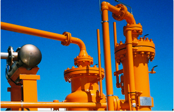
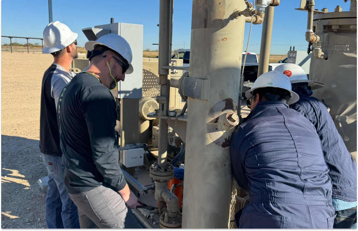
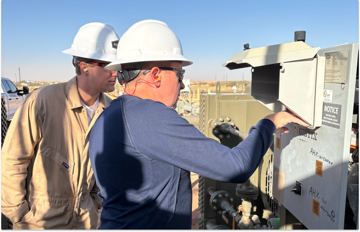
Flux is a data-driven platform that gives mechanics and area managers real-time insight into their fleet operations, allowing them to better monitor their runtime performance. The application allows mechanics to view and manage their vapor recovery units, and they work year-round in various environmental conditions to keep operations running smoothly.
Opportunity
Vapor recovery units require maintenance procedures to run efficiently. Mechanics often arrived on-site for routine maintenance without knowing what was wrong with a unit and sometimes without the parts needed to fix it. This meant extra visits and higher costs for field service teams.
Our VP of Software Engineering wanted to build an intelligence model that stores telemetry data behind a rules engine that generates recommendations for the unit. Rules are customizable across data types, unit information, and time periods, and are run through an API that ingests the data to detect violations. Recommendations are then generated automatically instead of relying on manual inspections from mechanics, catching operation issues sooner and saving costs for the business.
Role
As the product designer, my role was to collaborate with the product manager and VP to deliver solutions. I worked closely with the product manager to ensure the user flow was consistent with design standards and remained intuitive, while working alongside our VP to understand how the data was structured. My main responsibility was the flow for how users view and manage recommendations. I aimed to create a design that not only met functional needs, but also displayed information to users in a meaningful way as recommendations hold critical information tied to operations. We were given approximately one month, meaning design and engineering had to move fast.
Process
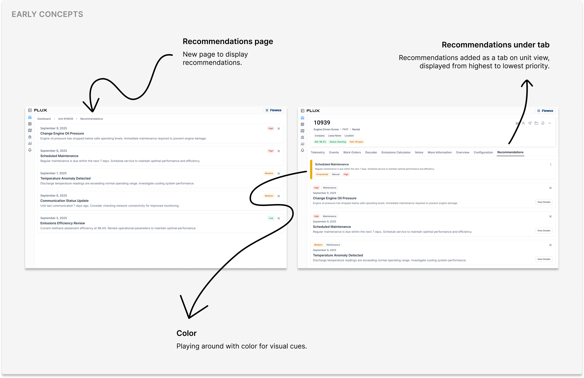
We used Figma Make to ideate on how this would fit into the product, while using our design standards as the foundation. Our first attempt was creating a product page for recommendations and organizing recommendation types into tabs. This didn't work because it meant the user would need several clicks to reach what they needed. We needed the experience to feel as frictionless as possible, so we went back to the drawing board.
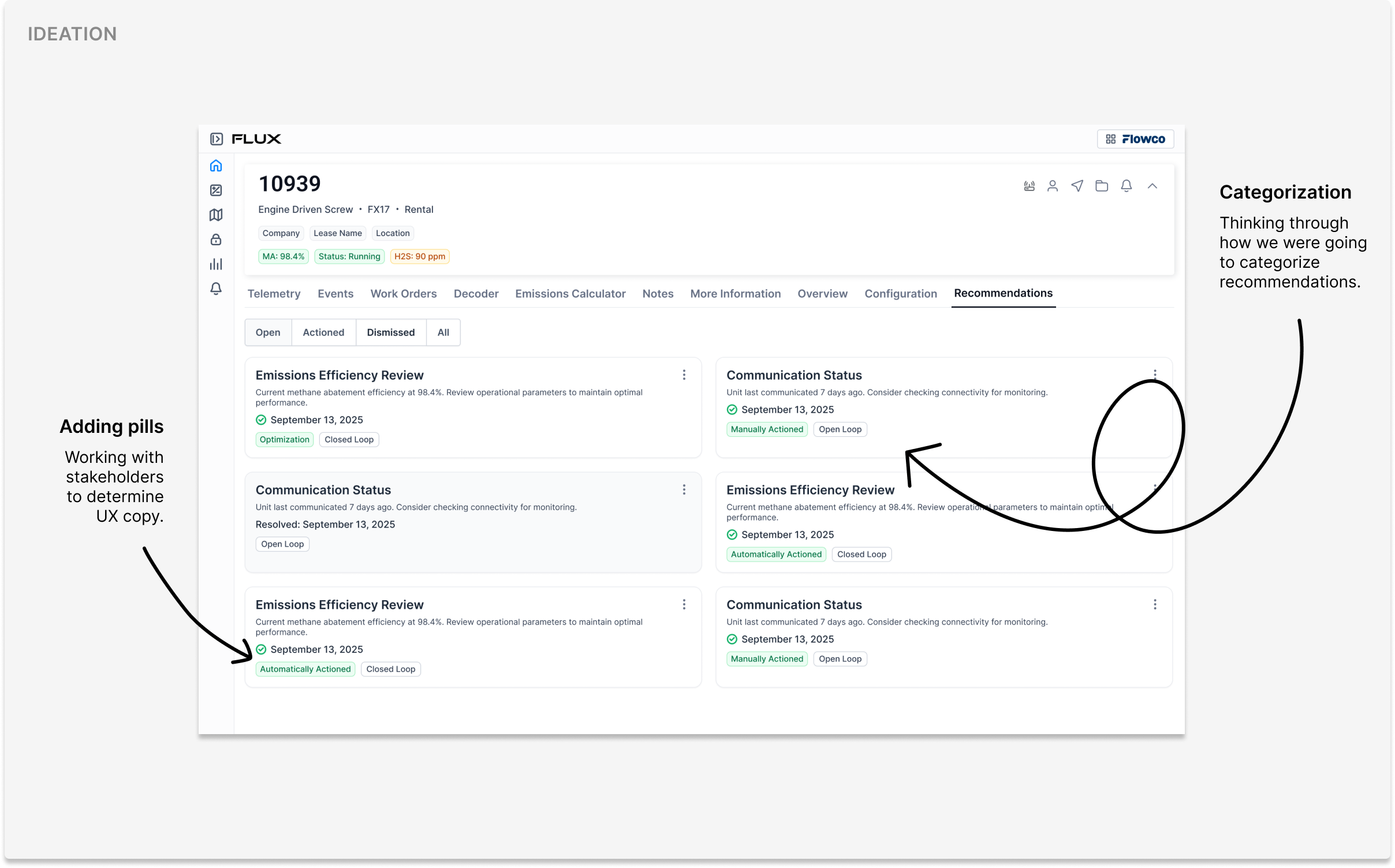
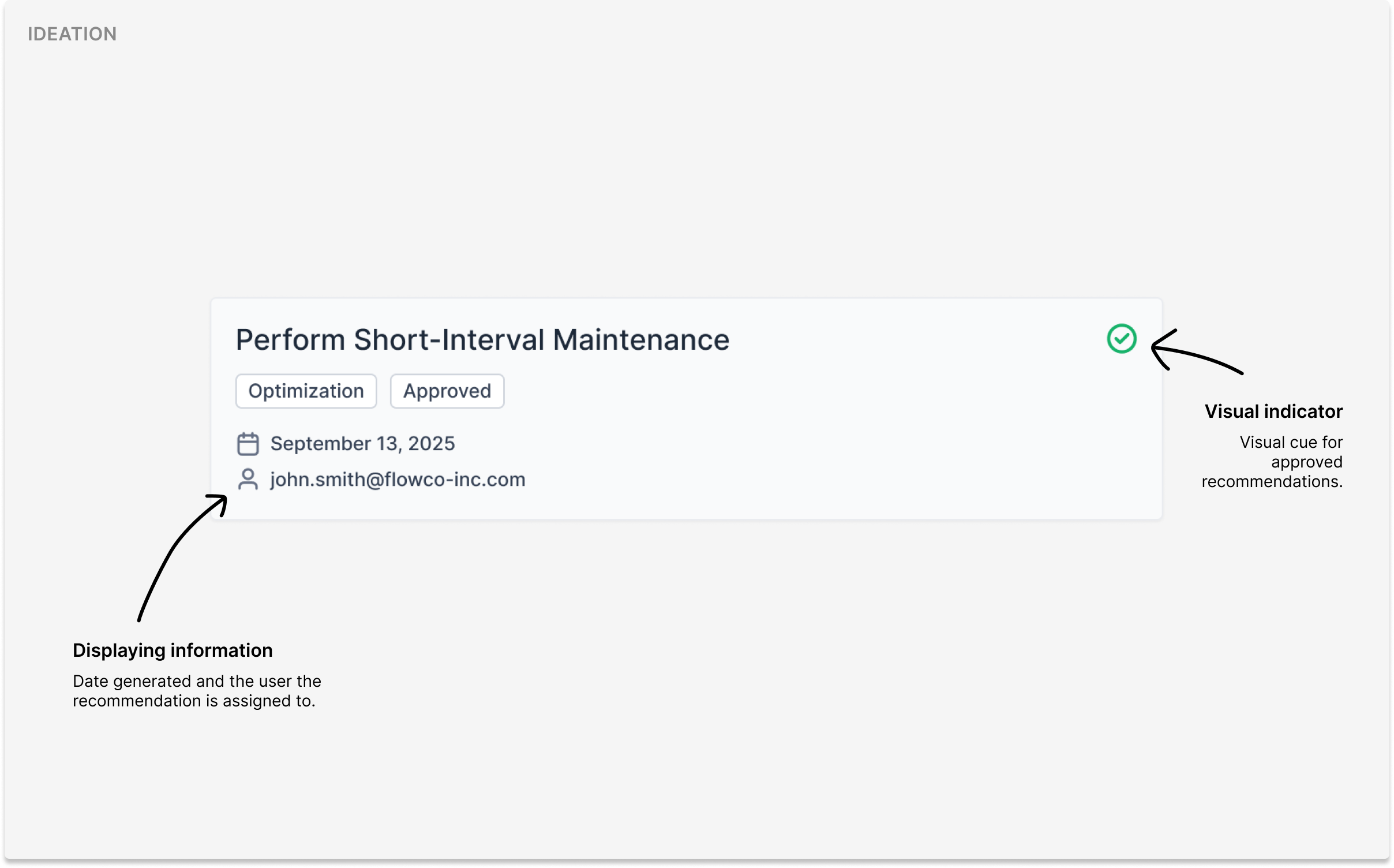
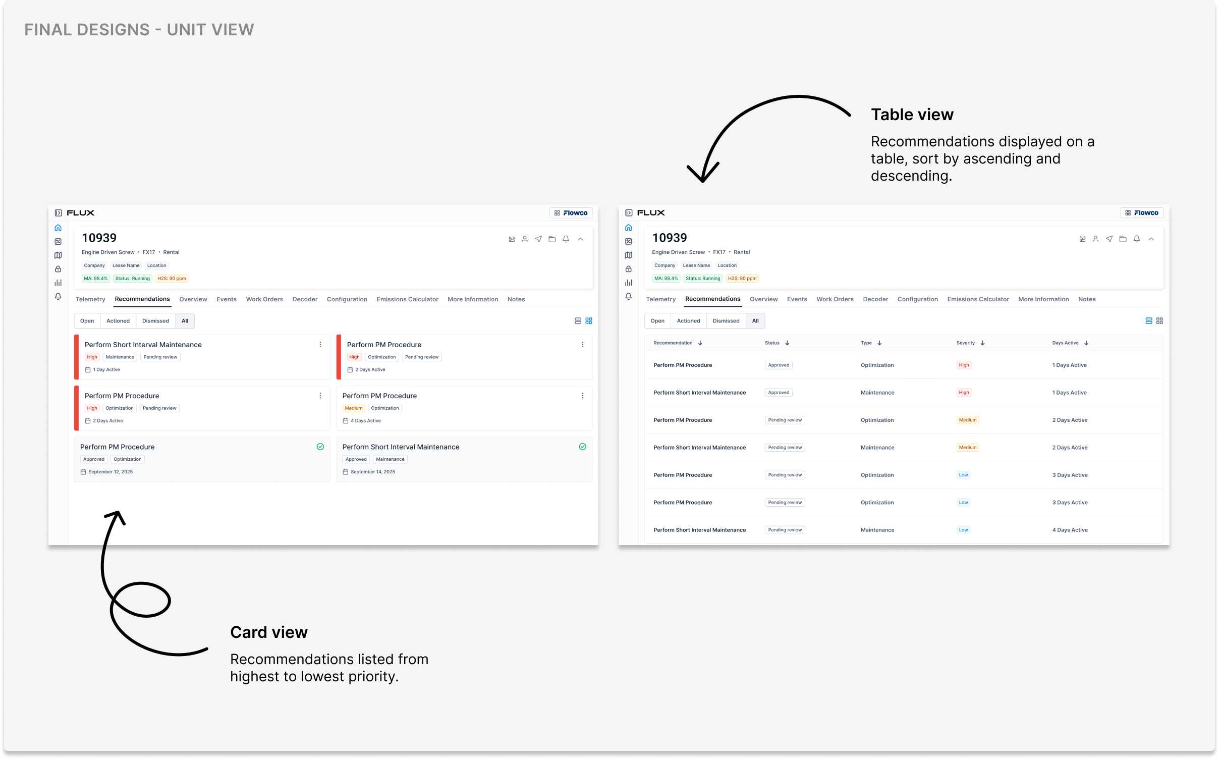
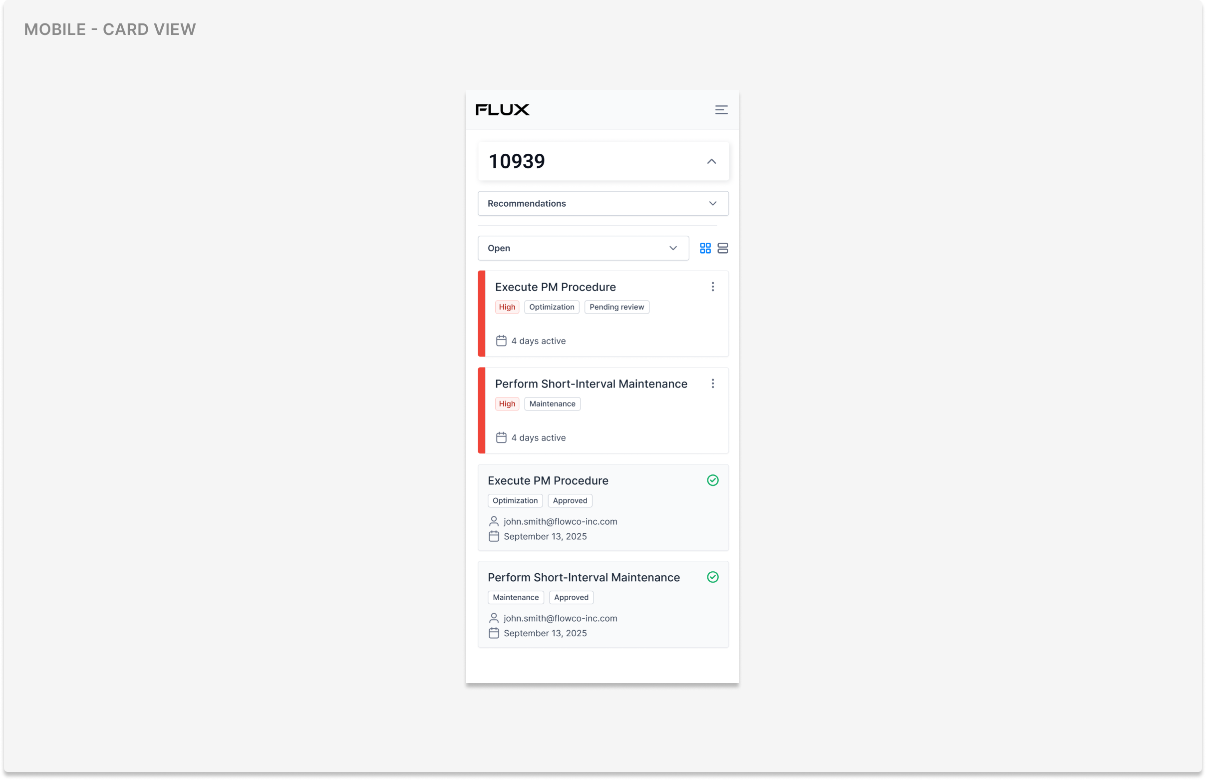
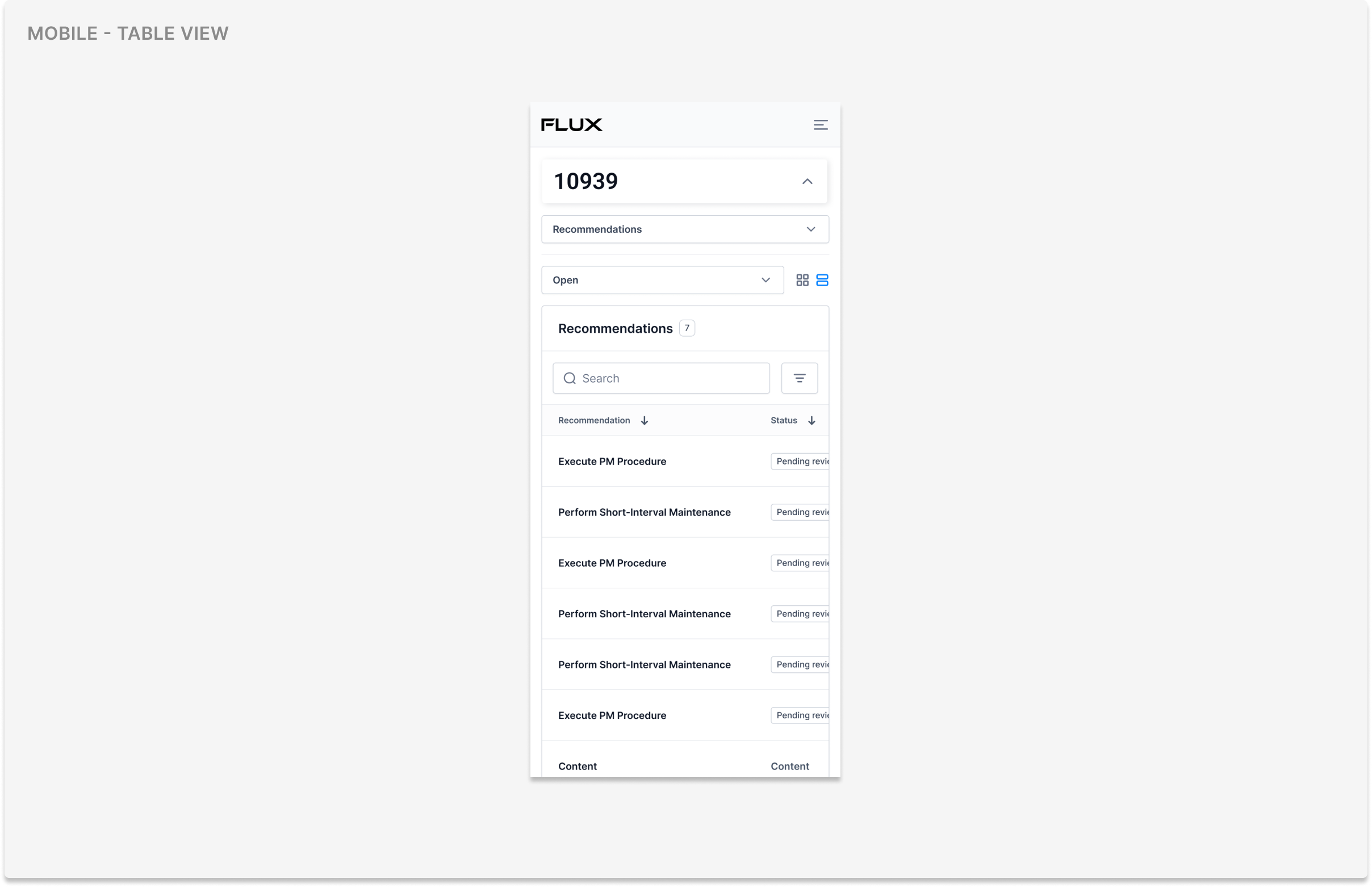
Our second attempt was a card view on the unit page itself that contained high level information alongside actions. I recieved feedback from stakeholders that recommendations would likely pile up and we would need to display as much information as possible, however they liked the visual of the cards. I wanted to keep the cards incorporated into the design for meaningful visuals, but provide another way to view information.
Results
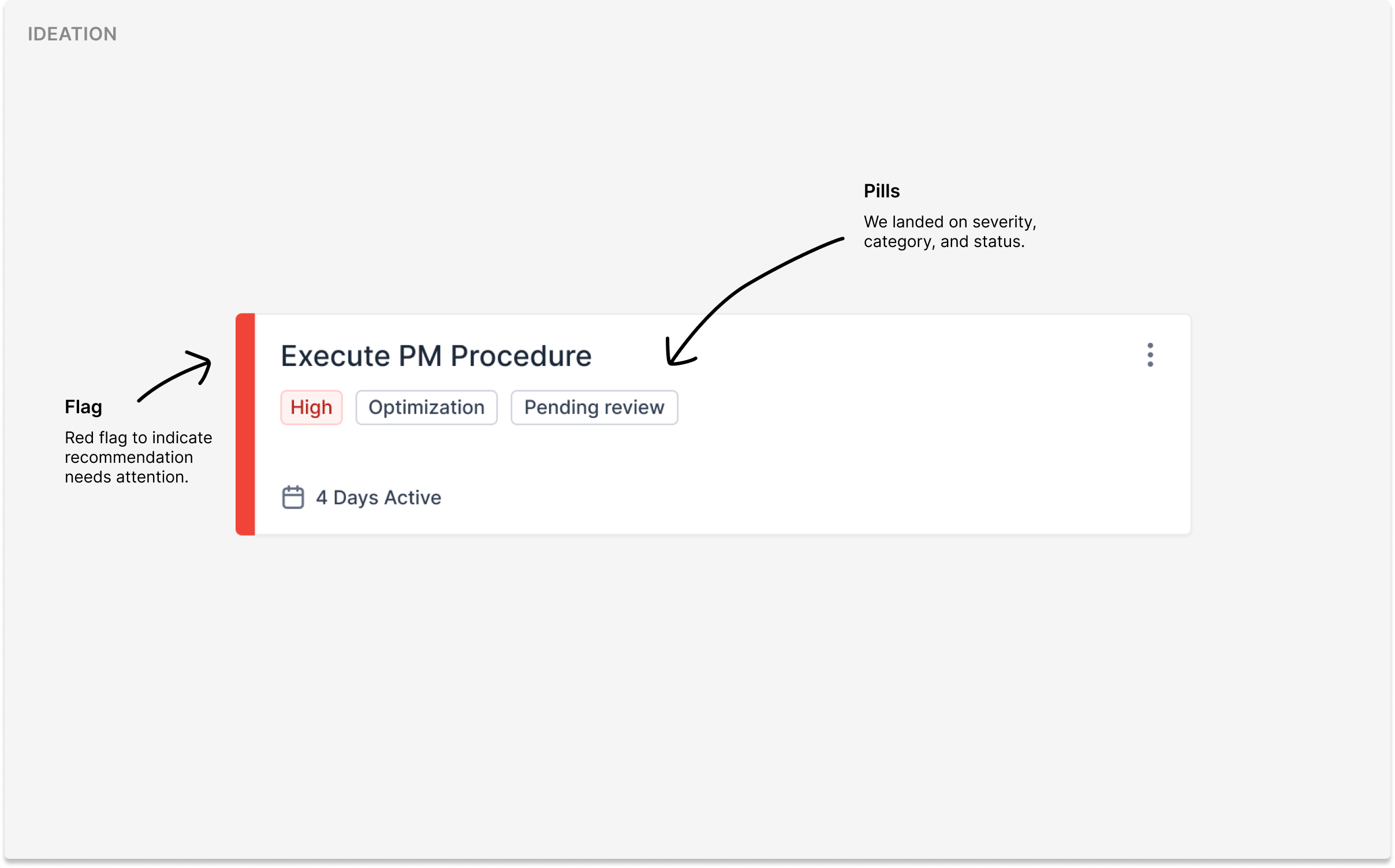
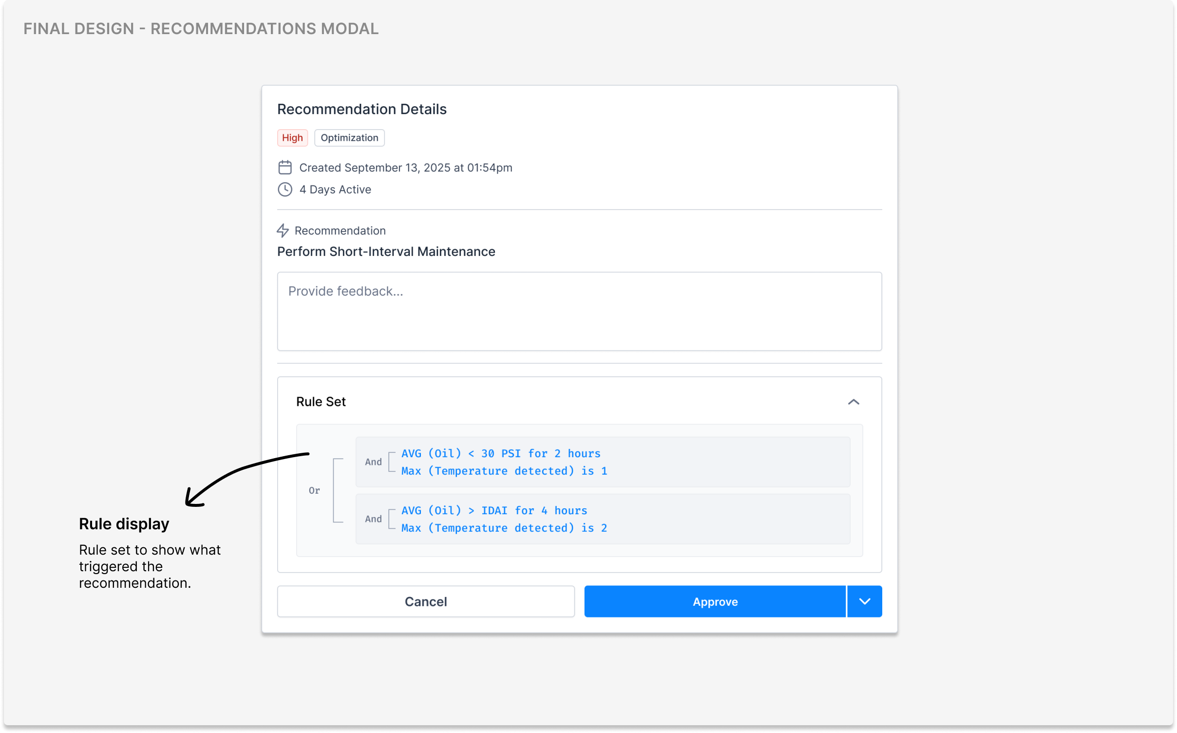
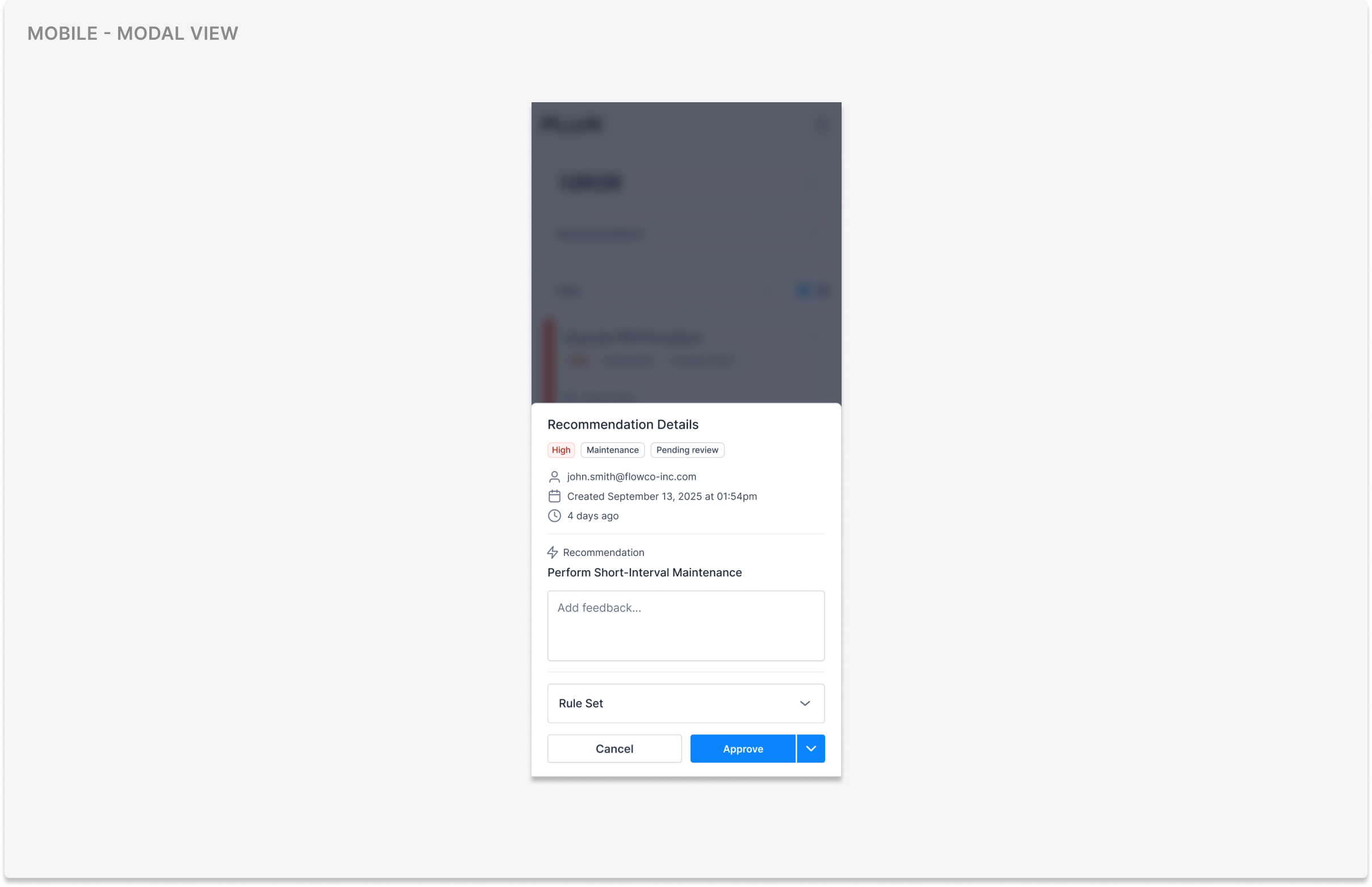
I ultimately landed on a design where cards separate what needs attention, two display modes so users can choose a layout that fits their needs, and visual cues for severity and un-actioned items. Users can then approve or dismiss a recommendation, add a description, and/or see the rule that triggered it.
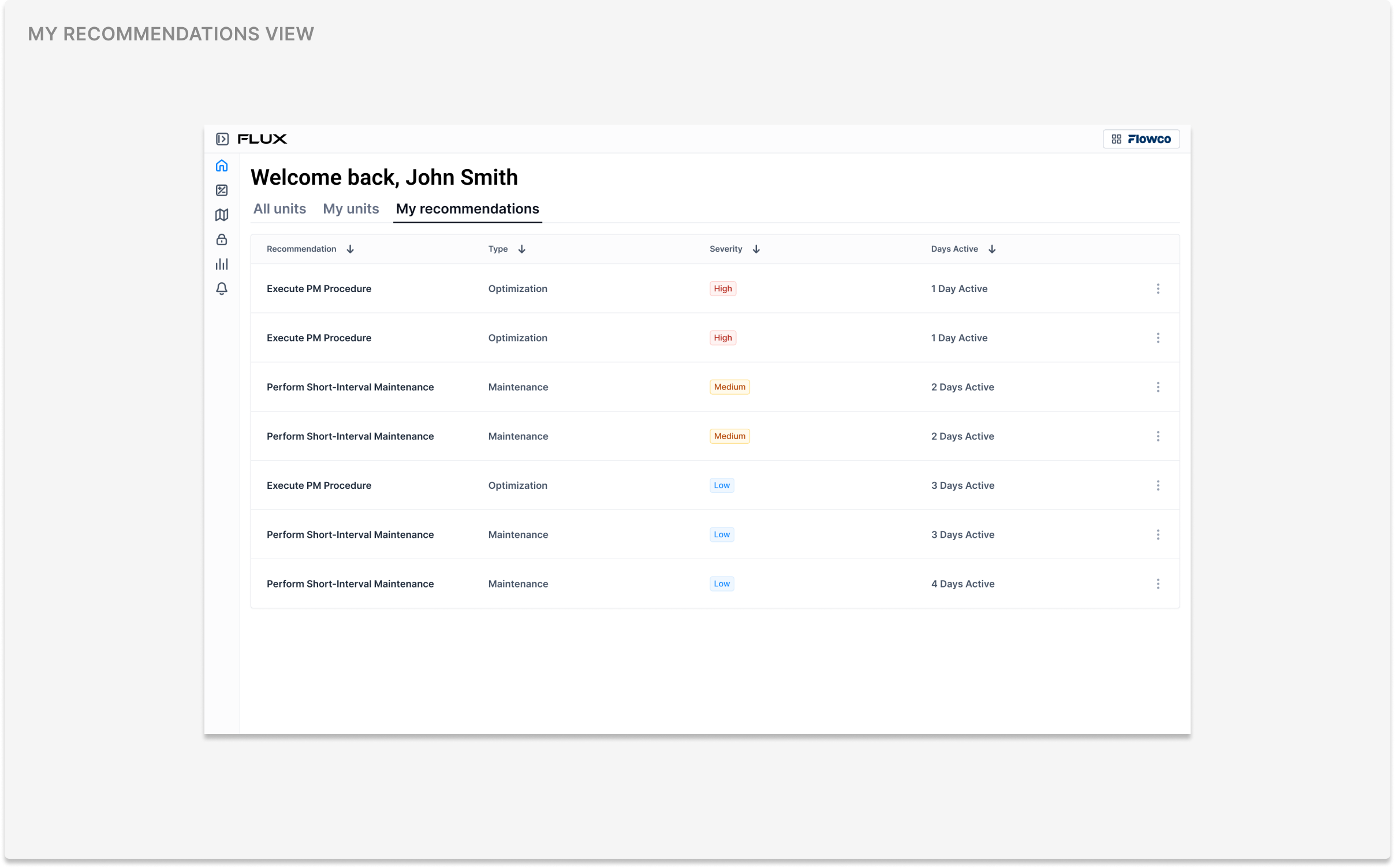
After a few rounds of testing, we recieved feedback that along with seeing unit recommendations, mechanics needed to see recommendations that are directly assigned to them, leading us to create a view for "My Recommendations" as one of the final steps.
Impact
Our team's on-site meetings provided many opportunities for collaboration, and the final designs were consistently influenced by stakeholders. We maintained open communication, soliciting their feedback and aligning on design decisions while the backend team traveled to the field to validate the data. This approach created a sense of trust and strengthened stakeholder relationships and allowed us to move fast, resulting in positive feedback regarding the impact this feature.
Overall, field operations run more efficiently and mechanics are now notified whenever a service is recommended on their unit, helping ensure the best possible runtime performance. This means they know what they need before heading out into the field, resulting in fewer field visits and lower operational costs for field service operations.
Reflection
Given more time, I would have spent more time with the mechanics in the field, using prototypes for A/B testing to better understand their preferences around the UX and interface. Often times, mechanics are too busy doing their jobs to check emails or respond to Slack messages, which makes it difficult to receive user feedback. Working in sprints, I've learned that one-on-one time in-person is the most effective way to gather meaningful feedback.